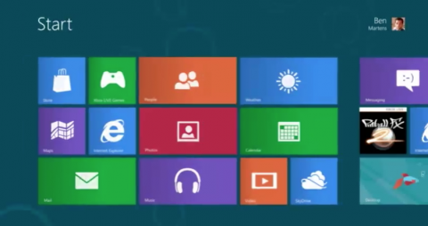
On Wednesday Microsoft announced the Consumer Preview release of Windows 8, and the flat Metro UI has caught people’s attention. Gone are the shading and reflections that contribute to a feeling of 3-dimensionality in many current interfaces. The Metro UI instead embraces a ludic simplicity in the form of basic geometric shapes and solid fields of color. While there has been a lot of positive buzz about the interface, it has its nay-sayers as well. Some have decried the interface as a regression which sacrifices the findability of 3D icons in favor of a colorful, trendy design. And to be honest, doesn’t it look a tiny bit like this?
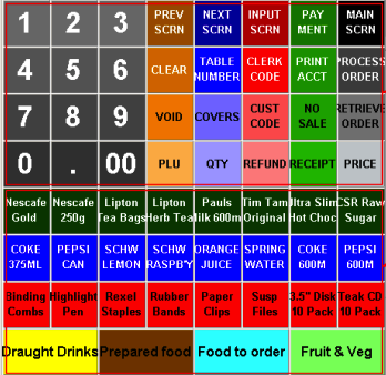
Clearly, the new display has less visual information than previous versions (in the sense that more detail literally requires more bits). Knowing this, it can be difficult to avoid the knee-jerk worry that the Windows 8 designers have thrown out something we might need (which is the same reason I never seem to be able to throw out old MIDI cables — you just never know). Some designers have even expressed concerns that flat elements may not pop out as well as elements with more apparent depth. But in fact, depth has relatively little to do with the psychological phenomenon of “pop-out.” Pop-out refers to search involving those features of objects that can be apprehended pre-attentively — that is, almost instantly. To illustrate, try finding the red T in the illustration below.
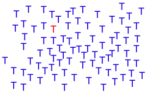
Not terribly difficult, is it? And this would be true regardless of how many blue Ts appear on the screen. A red T will always pop out from among a field of blue Ts.
Now try finding the L in the next illustration.
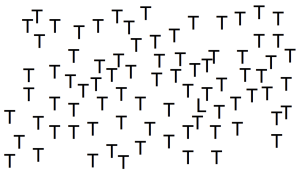
This is considerably harder (and it will continue to get harder and harder still as the number of distractor Ts increases). The reason why the second task is more difficult than the first is that L shapes do not pop out from T shapes.
Although the word “pop-out” suggests three-dimensionality, depth is actually not a pre-requisite for the phenomenon (and indeed, in the early days of visual search studies, technological limitations would have made it difficult to study scenes with any extensive dimensionality at all). Prototypical pop-out features tend to be simple, such as color, size, motion, and orientation.
Depth can nevertheless produce pop-out. This was demonstrated by Dorothy Kleffner and Vilayanur Ramachandran (1992) in a study using computer-generated gradients to simulate concave and convex objects, as shown below.

As in the case of red and blue Ts, the one bump in the field of dents is pretty easy to find. For the past several years, interface designers have been taking advantage of depth cues like these to enhance the sense of separation between elements (a matter which I’ve studied extensively) and to create easily scannable scenes. But the failure to include obvious depth cues in much of the Metro UI does not mean that users will be slowed and stymied by unfindable objects. There are plenty of other ways to accomplish these goals.

Examining the Metro UI again, it’s clear that it incorporates several of these. Colors are clear and distinct, making it easy to seek out each button from the rest of the tiles. Although shape is not a reliable pop-out feature, the icon set size of the Metro interface is small (that is, there are not many icons in each grouping), and icons are uniquely and memorably shaped, which should increase the speed of search (although without reading the label I’m not sure what the cotton boll in the lower right hand corner is intended to represent). Slight luminance differences also help tiles stand out from one another without creating a sense of physical protrusion. I am curious as to why the designers decided on particular tile sizes (is weather more important than Internet Explorer, for instance?), but overall the visual layout appears to satisfy the basic requirements for a comfortable user experience. Of course, it remains to be seen whether the functionality and information architecture will satisfy users’ needs as Windows 8 is really put through its paces.
Note: This post was written prior to my employment at Microsoft. No changes to the content have been made since that time, except to update links and post tags.
—
Reference
Kleffner, D. A., & Ramachandran, V. S. (1992). On the perception of shape from shading. Perception and Psychophysics, 52(1), 18-36.